Bofin
- Mobile
- B2C
- Fintech
- Product design
- Brand identity
A fintech start-up with a new way to do your digital finances.
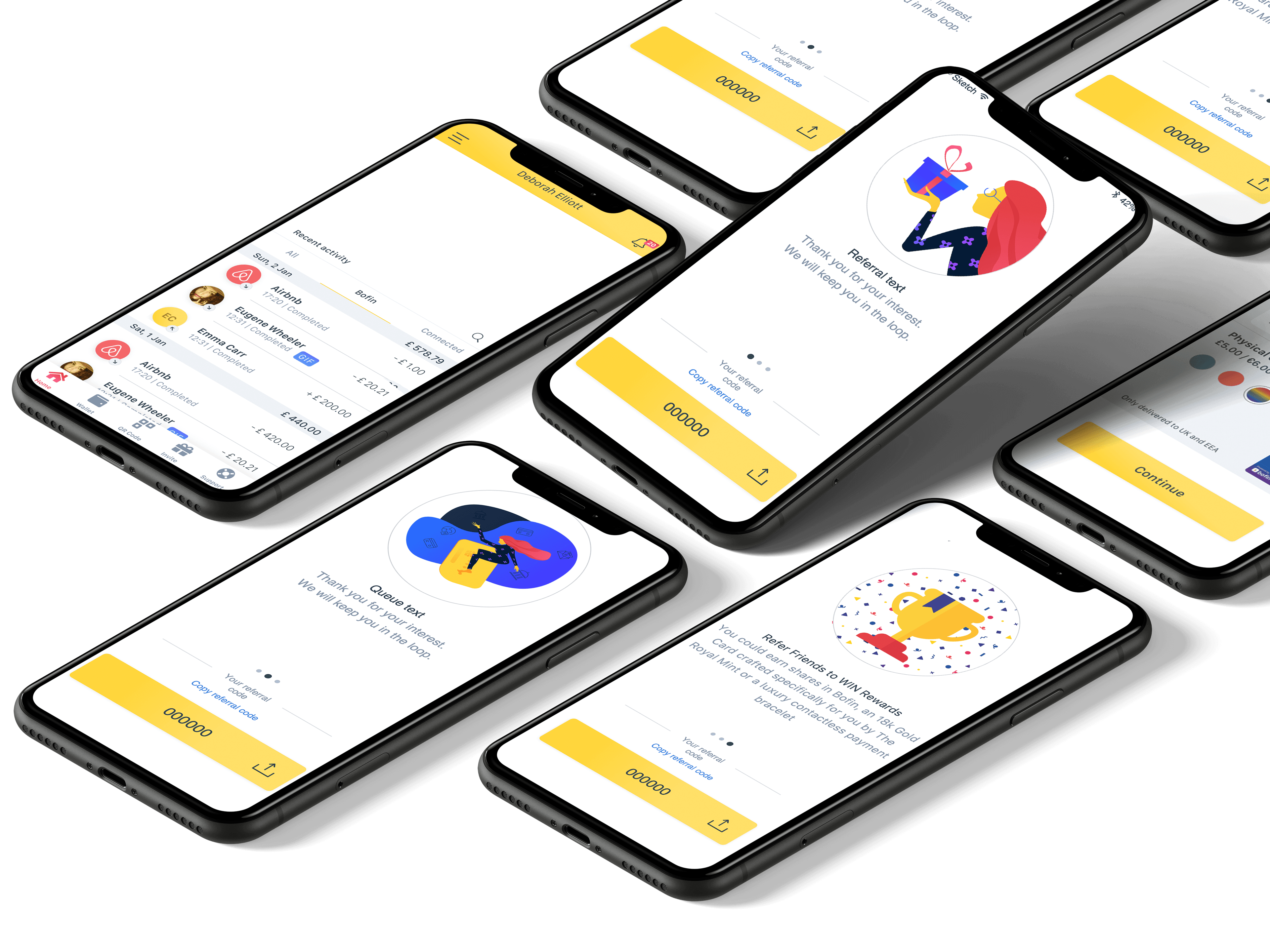
I worked on Bofin's cross-platform fintech application and was a key member behind its full rebrand, including app, logo, colour and a physical debit card.
Defining the problem
- 01Turn a founder's vision for QR payments into flows that work for customers, merchants and staff.
- 02Design once for iOS and Android, with requirements arriving from several departments.
- 03Rebrand the company while the product was still being built.
Bofin was moving fast and changing as it went. The work had to hold its quality under tight timeframes, and stay consistent from an app icon to a card in someone's hand.
Shaping the approach
Map the whole payment. The QR Pay flow covers the bill, the payment, the tip, and separate receipts for customer and merchant, plus the staff view of transactions.
One design for two platforms. Screens lean on iOS and Android best practice, built and handed over through Sketch, Zeplin and Figma.
Brand at every size. The new symbol was drawn to work as an app icon, on a splash screen, on the card and on a street poster.
What we shipped
- 01
Research and user journeys
- 02
App interface
Activity, QR Pay, referrals and receipts.
- 03
Rebrand
Symbol, logotype, colour, tone of voice and packaging.
- 04
Debit card and launch material
Proof of the craft
App, brand and card
Product and identity work for one start-up, inside one team.
iOS and Android, one flow
Customer, merchant and staff views of a single QR payment.
From app icon to street poster
The identity ran on a physical debit card and outdoor advertising.
- Year
- 2020
- Role
- UX/UI designer
- Sectors
- Fintech
- Platform
- Mobile
- iOS
- Android